Move Over, Mercator: World Maps in Boston’s Public Schools
Schools in Boston recently decided to make the switch from the Mercator projection of world maps to the Gall-Peters projection, becoming the first American school system to do so. While seemingly uninteresting, making the switch from the Mercator projection is a step toward inclusivity and one that other schools should consider making.
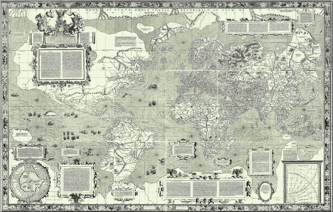
The differences between the two projections were brought into pop culture in the early 2000s in an episode of The West Wing, but the controversy over the different projections has existed since the creation of the Gall-Peters projection in 1974. In order to make the three-dimensional world fit on a two-dimensional sheet of paper, map makers have to sacrifice certain accuracies for others. The Mercator projection is the most common world map projection, one that basically everyone saw in school growing up. Originally created for European navigators in the 1600s, the projection has some egregious discrepancies – like the fact that Greenland and Africa appear to be the same size, when Africa is actually 14 times the size of Greenland.

A projection such as this, be it intentional or not, creates a vastly skewed view of the world. Since the Mercator projection is designed so that land masses become larger the further they are from the equator – a consequence of maintaining straight longitude and latitude lines for navigators – it appears that the areas of the world predominantly populated by whites are equivalent in size to predominantly black or latino regions such as Africa and South America. On the other hand, the Gall-Peters projection shows land masses in proportion to one another, leading a more accurate view of relative size and removing the Eurocentric discrepancy. The map has even been adopted for use by the United Nations and is championed by UNESCO, the specialized United Nations Educational, Scientific, and Cultural Organization tasked with promoting international collaboration through educational, scientific, and cultural reforms.
Boston’s switch comes from a movement to “decolonize the curriculum” within three years, according to The Boston Globe. While higher education institutions have made the push toward a less Eurocentric US education – Yale University students pushed for a decolonization of the English program last year – the American school curriculum is still Eurocentric, often giving a biased view to students of history, race relations, and immigration patterns. A controversy over the wording used to describe the slave trade in McGraw-Hill textbooks in 2015 sparked a national conversation about how history is addressed the students, often glossing over or omitting details about non-white racial groups and not discussing the serious wrongs done during slavery. Maps, a good starting point to addressing the serious errors in history textbooks, allow students to understand that maps created during the era of colonization do not hold up today and that the new projection provides a more truthful visual of the world.
Boston has decided to phase in the map transition slowly, allowing students to compare them side by side and placing the new projections in second, seventh, and eleventh grade classes to start, since those grades have world culture, world geography, and world history in their curriculums already. The projection will later be incorporated across all grades. In a predominantly non-white school community, with 86 percent of students identifying as non-white, Boston is striving to increase their students’ cultural competency. Given the state of American politics, teaching children to be more culturally competent is a necessity. Switching to a less biased map projection is a simple fix that could result in a less Eurocentric and more worldly perspective for the average member of the next generation.


